
Iterative Refinement
Surfaced recurring subscriptions as a distinct module within the dashboard
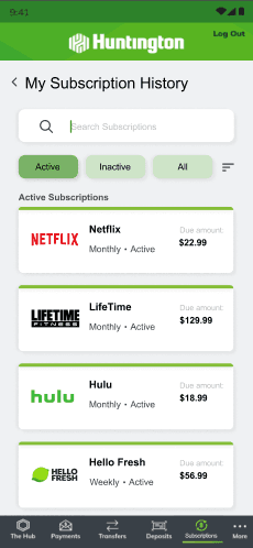
Prioritized subscription cost and billing cycle information to support faster recognition of recurring charges
Introduced entry points into subscription details to centralize management actions
Initial High-Fidelity Direction
Reduced visual density to improve scanability of active subscriptions
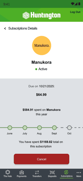
Changed colors of cancel button to create a clearer primary action hierarchy
Increased spacing between billing details and brand elements to support financial clarity
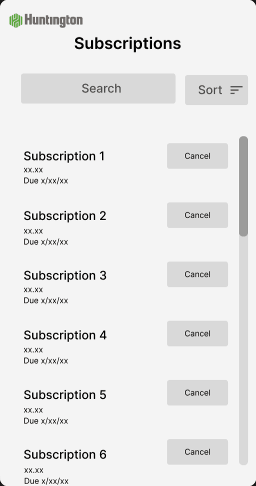
Introduced filtering elements for easier maneuverability
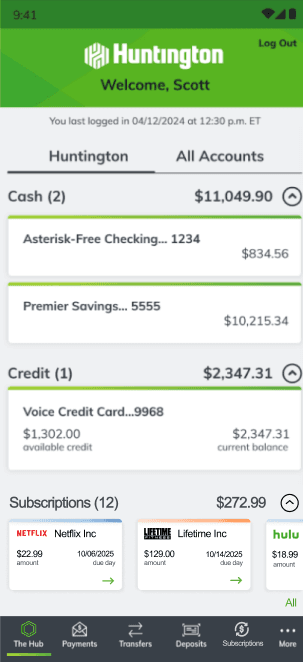
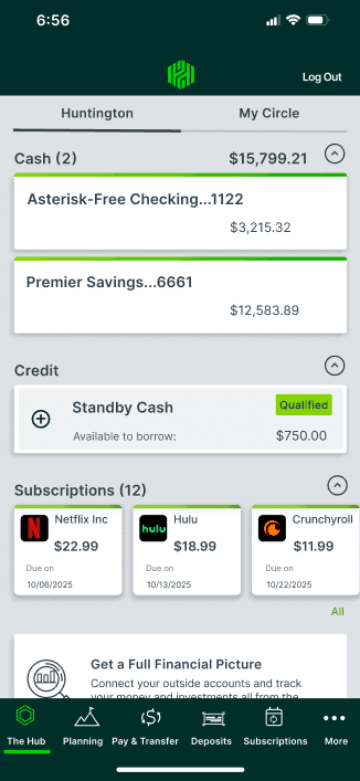
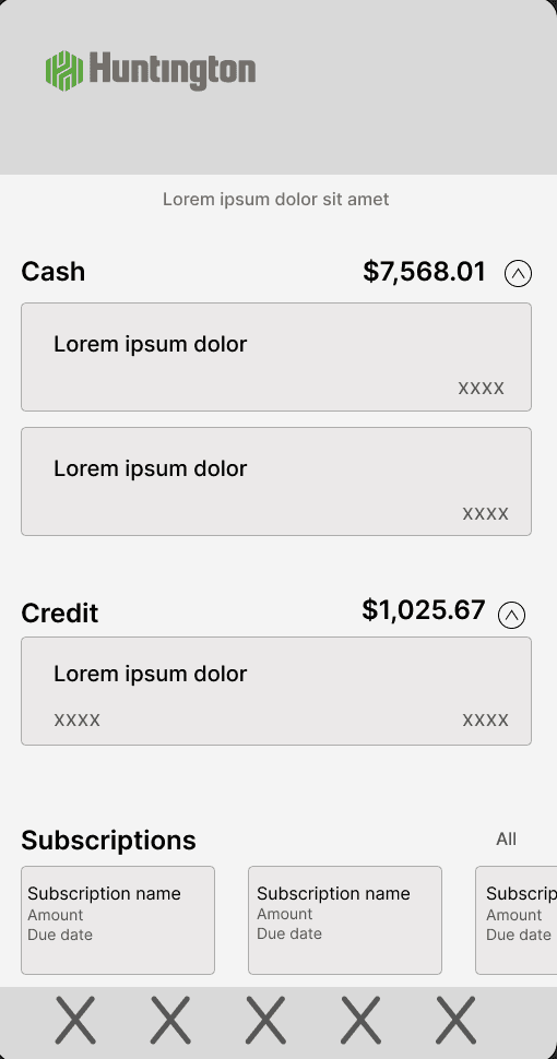
1. Dashboard Subscription Module
Key Design Decisions
After
Recurring subscriptions are surfaced as a dedicated dashboard module for quick identification.
Before
Users had to manually search through individual account transactions to identify recurring charges.
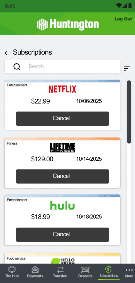
2. Centralized Subscription List
After
A dedicated subscriptions page allows users to view, filter, and search recurring services.
Before
Users lacked a single location to review all active subscriptions.
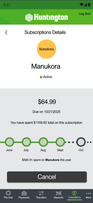
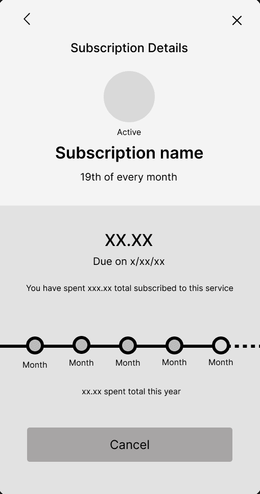
3. Detailed Subscription Management
After
A detailed view displays billing amount, subscription duration, and cumulative spend over time.
Users had limited visibility into subscription duration or total spent.
4. Multiple Management Entry Points
After
Users can cancel subscriptions directly from either the dashboard or detailed view.
Before
Cancellation required navigating through transaction histories.
Before
SOLUTION & IMPACT
Streamlining Subscription Management Through Centralized Controls
My final designs reflect insights gathered during user research, which revealed that users struggled to locate recurring charges and felt hesitant to manage or cancel subscriptions due to unclear billing information. The following design decisions were introduced to improve subscription visibility, simplify navigation, and support more confident management of recurring expenses. By reducing user fatigue and increasing transparency around ongoing financial commitments this would encourage greater engagement with in-app financial management tools, strengthening the app’s utility as a centralized platform for subscription oversight.
The following interface screens reflect how these design decisions were implemented to support clearer visibility and more confident management of recurring financial commitments.
The Final take
CASE STUDY
Huntington
Subscription Management Tool
k
M
L
J
z
Dashboard Overview
Subscription List
Subscription Details
Mid-fidelity wireframes focused on structure, hierarchy, and core actions before visual refinement
After validating the core flow and information hierarchy, I moved into high-fidelity exploration to refine visual clarity, emotional tone, and brand alignment. These iterations focused on improving readability, reducing cognitive load, and creating a calmer, more trustworthy experience appropriate for a financial product. I explored multiple visual directions to test spacing, contrast, component styling, and interaction emphasis, while later incorporating UI updates introduced during Huntington Bank’s design refresh.
High-Fidelity Exploration & Iteration
Strengthening Financial Awareness by Simplifying Subscription
Management for Huntington Users
Subscription Management is Harder Than it Should be
OVERVIEW
PROBLEM
This project introduces an intuitive, transparent system that helps customers understand, track, and manage recurring payments directly within the Huntington app. By reducing confusion and giving users more control over their subscriptions, this feature supports Huntington’s goal of increasing financial confidence and digital engagement.
Huntington users currently have no clear way to view or manage their recurring payments, causing many to overlook renewals or feel unsure about where their money is going. While competing banks like Chase and Wells Fargo already offer tools that surface recurring spending patterns, Huntington lacks a unified subscription view — leaving users to rely on emails, memory, or manual tracking. This gap creates financial uncertainty and reveals a strong opportunity to improve transparency and user control.
My Roles
Tools
UX Design
UX Research
Information Architecture
Figma
Google Docs
Notion
Timeline
12 Weeks
Users underestimate & overlook
recurring charges
The average consumer now holds around 12 paid subscriptions, and 74% underestimate how much they spend monthly.
Users lack a simple, centralized view of recurring expenses
Nearly half of consumers (47%) have forgotten at least one recurring subscription
Understanding How Users Manage Subscriptions Today and How Huntington Compares to Competitors
RESEARCH & FINDINGS
To validate the problem and shape the feature, I conducted a competitive analysis and ran five one-on-one semi-structured interviews with Huntington customers who pay for multiple digital subscriptions. Participants ranged from 2 to 15 subscriptions, relying on a mix of mental lists, email receipts, and bank statements to track charges.
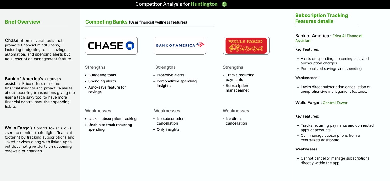
Competitive Analysis
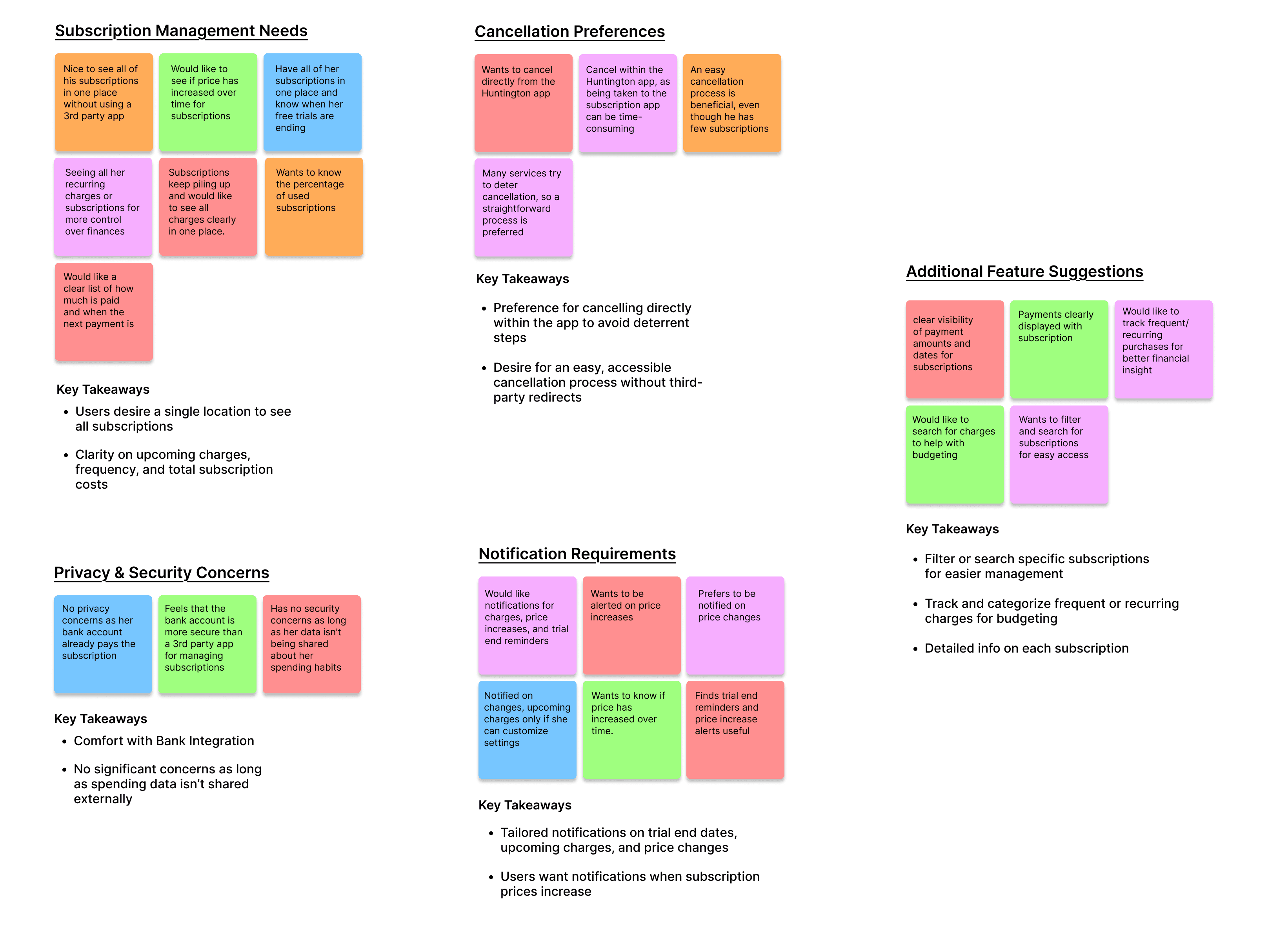
Affinity Map
*I reviewed tools offered by Chase, Bank of America, and Wells Fargo to understand how competitors support recurring expense visibility and what gaps Huntington could address.
*Synthesized interview data into themes around how users remember, track, and manage subscription charges.
How Research Shaped a Polished Subscription Experience
PROCESS
I began by translating research insights into quick low-fi and mid-fi concepts to explore how subscription management could feel simpler and more calming for Huntington users. My early designs focused on structure and information hierarchy rather than visual detail, allowing me to validate the core flow before refining the interface.

What I did:
Visibility Supports Financial Confidence
What I did:
As I progressed through this project, I found that introducing financial management tools requires balancing visibility with user confidence. In the context of subscription oversight, I found that surfacing recurring expenses needed to be done in a way that supported intuitive interaction without overwhelming user decision-making. Designing for financial management reinforced the importance of simplicity, where actions must remain accessible and understandable to encourage user engagement.
Users expressed hesitation when reviewing recurring expenses due to unclear billing cycles and limited visibility into cumulative subscription spend.
Managing Financial Decision Fatigue
Designing for Confident Financial Decisions in Subscription Management
FINAL THOUGHTS
Prioritized surfacing recurring subscriptions directly on the dashboard
Reduced dependency on transaction history scanning
Introduced cumulative spend indicators within detailed views
Provided direct cancellation pathways to support faster action
Recurring charges were embedded within transaction histories, requiring users to manually identify and track ongoing financial commitments.
Supporting Subscription Discoverability
Key Learnings
Created a centralized subscriptions page
Providing users with clearer billing information and spend timelines may reduce hesitation when managing recurring financial commitments.
Introduced filtering and search capabilities
Added persistent entry points into subscription management
Centralized Management Reduces Cognitive Load
Consolidating subscription oversight into a single flow can simplify decision-making and improve engagement with in-app financial tools.
The final design directly addresses user challenges identified during research, including difficulty locating recurring charges and hesitation around cancellation. Surfacing subscriptions as a dedicated dashboard module and introducing persistent management actions reduces the need to manually search through transaction histories, improving scanability and lowering cognitive load when reviewing recurring expenses. Providing clearer billing information and direct cancellation pathways supports faster recognition of ongoing financial commitments and enables more confident management decisions. Encouraging users to manage subscriptions within the app increases engagement with in-app financial management tools and reinforces the app’s utility as a centralized platform for ongoing expense oversight.
Improving Subscription Visibility and User Control
Users Lack a Single Place to See All Their Subscriptions
01
Many participants tracked subscriptions across email, bank statements, and mental notes. This made it hard to understand recurring expenses or spot forgotten charges.
“I just scroll my statements and hope I didn’t miss anything.”
Putting Everything Together, Here's What Stood Out:
Users Want Clarity on Renewal Dates & Price Changes
02
Users struggled to remember when subscriptions renew and were often unaware of price increases until they saw the charge on their statement.
“I wish I knew ahead of time when something was going to renew or go up.”
Competitors Surface Insights, but Lack Full Management
03
Competing banks like Chase, Bank of America, and Wells Fargo offer spending insights and subscription detection, but do not provide comprehensive tools for managing, canceling, or centralizing subscriptions.
Users Value Simplicity & Don’t Want Feature Overload
05
Users liked the idea of subscription tools but were clear the system needs to be simple, clean, and not overwhelming.
“Just show me what I have and what I’m paying don’t make it complicated.”
Users Want More Control, Not Just Awareness
04
Beyond visibility, users wanted to take action — cancel, pause, or modify subscriptions — rather than only receiving alerts.
“I hate having to hunt down where to cancel something… I wish it was all in one place.”
Explore the Design
© 2026 Kauthar Moussaid · Designed & Built in Framer